In the age of social media, simply creating content to stay relevant is not enough. You have to know how to do it right. Creative design that attracts viewers is the way to go!
It is not surprising that video is the queen of social media content. With tech giants such as Google and Meta prioritizing original videos and reels on their algorithms, your law firm must invest in a video marketing strategy for social media. And it doesn’t stop there.
For platforms like Instagram and Facebook, it is crucial to post video content and make them as appealing and interesting as possible. One great way to achieve this is by designing captivating thumbnails for your videos and reels.
If you want to master the art of thumbnail design for social media, we show you the best and most practical tips you can use without being a professional graphic designer.
What are thumbnails, and why are they important?
Look at it this way: If first impressions matter, then your social media thumbnails are the first impression of your brand’s online presence. And it really, really matters.
In short, thumbnails are still images that act as the preview for your video or photo post. Like a book or magazine cover, it should be as captivating and representative of your brand as possible.
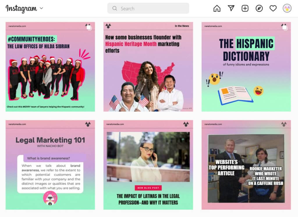
Thumbnail design is important, not just for posting videos but also for giving your social media platforms a consistent, clean look. Take our Instagram page as an example:

We use social media such as Instagram to promote a new, dynamic aspect. We achieve this mission through creative thumbnails. This applies to more visual platforms such as TikTok and YouTube, where your content is fiercely competing for users’ attention.
Amid the rapid growth of digital content—90% of digital data in the world in 2018 was created in the last two years—thumbnails are great tools to help you stand out from the crowd. Here’s how you can do it:
How to design attractive thumbnails

Nowadays, you can be a graphic designer without earning a degree. With apps like Canva and Freepik, you can find many free templates and designs for any digital platform. However, mastering the art of thumbnail design is not as easy as downloading a template and changing the text.
Ideally, your design is a reflection of your brand. If you want to communicate that you are a serious, business-oriented law firm, you will probably use neutral colors and bold fonts for your design.
To establish your brand’s online presence, here are some questions you should consider first:
1. How do I want potential clients to perceive my business?
We’ve said it countless times: Your brand is the reflection of your business. If you want potential clients to perceive your business as modern and luxurious, then your thumbnail design can reflect that. Here’s an example from Lawboss:

As you can tell, they established a simple but elegant design for their social media. The key here is consistency.
2. What kind of values do I want my brand to promote?
Ideally, there are set values that guide your business. When building your brand identity and your social media presence, you must ask what values you want your business to reflect.
At Nanato Media, our business model is built on multiculturalism, integrity, and partnership success. We ensure our social media marketing efforts, including our thumbnails, reflect these values:
3. How does my brand stand out from the competition?
When your business is one of many offering the same product or service, how do you stand out from the competition? You can go about it with two simple steps: 1. Offer exceptional customer service, and 2. Invest in outstanding marketing efforts that consider your buyer persona.

It sounds easier than it actually is, we know. It is clear that to surpass competitors, it takes a great deal of time and resources that you may not initially have. However, even if you can’t pay exorbitant amounts of money for marketing, you can start by defining clear design guidelines for your social media content.
Pro tip: If you have the means to invest in mindful, innovative marketing, then do it! Don’t neglect the power of crafting a marketing strategy that distinguishes you from other brands.
We show you the best tips to set up your law firm’s digital marketing strategy on a budget.
Tips for designing attractive thumbnails

Whether you want to design thumbnails for videos or your social media feed, basic design principles will help you attract potential clients. Without any further ado, we show you seven essential components of your thumbnail design:
1. Copywriting matters!
We’ll get to the visuals part in a second, but first, let’s discuss creative copywriting. Ideally, your thumbnail will include a concise and eye-catching description of your content. Take a look at this thumbnail by Alex Cattoni:

Pretty straightforward, right? We know from the get-go that the article will discuss what NOT to do regarding marketing copywriting. Bonus points for creative placement and bold fonts!
Pro tip: While clickbait is commonly used to attract more viewers, misleading users will negatively affect you more than help you. The goal is to build trust by providing users with valuable information.
2. Use high-resolution images
We can’t stress this enough: Use high-resolution images in ALL marketing efforts, including your thumbnails. Nothing screams “I don’t care about my online presence,” like using bad-quality pictures you downloaded from the internet. If you’re looking for high-quality stock images FOR FREE, check out Unsplash and Pexels.
3. Add ‘personality’
By personality, we mean an actual person! If anyone from your business is the image or spokesperson, you should add a friendly, familiar face to your thumbnails. Take Uncle Ardy from Pirnia Law Group and his usual appearances in the firm’s advertising:

4. No clutter
One massive problem with thumbnails is the clutter. If you cannot summarize the content, consider breaking it down into different slides with tiny bits of information. Here is a standard distribution of information in a single thumbnail:

Just make sure to add attractive images and graphics accompanying the text.
5. Use the proper thumbnail dimensions
The beauty of graphic design platforms like Canva is that you can immediately create a graphic for a social media channel with the proper dimensions without even thinking about it. However, if you are designing your images, follow thumbnail dimensions, not cut out essential aspects of your design.
Pro tip: You can follow this social media dimensions cheat sheet from Hootsuite.
6. Design for mobile
Mobile-first marketing is here to stay, especially among Hispanic audiences. Designing for mobile applies to more than just thumbnails. You can get creative by designing interactive posts, carousels, and reels that take a mobile-first approach. Check out these examples from Airbnb’s website:

7. Call to action
It’s pretty self-explanatory, but a call to action (CTA) in marketing is any design to prompt an immediate response or sale. As a rule of thumb, your thumbnails should include a CTA if you’re promoting a product, offering a service, or even linking to your brand’s website.
Here’s a direct CTA from Later that you can imitate for your own social media to promote content from your website:

Our takeaways
If you have never considered thumbnail design as a tool to attract new audiences and reach potential clients, then we hope this article helped you understand the power of mindful thumbnail design.
Even if you are not a graphic design expert, we can assure you that these design tips are user-friendly and applicable to other types of advertising. However, we don’t want you to refrain from investing in talent that solidifies your brand through expert graphic design.
If you are still unsure about hiring a marketing agency to handle graphic design for you, then, by all means, take small steps, such as creating attractive thumbnails for your social media. You will find the value of mindful graphic design in no time!


